MY ROLE & RESPONSIBILITIES
- Phone: +61 467 946 390
- Phone: +61 467 946 390
- Phone: +61 467 946 390
TIMELINE
3 weeks from start to finish
This project focused on addressing users' travel challenges, this project employed interviews and a survey to pinpoint a prevalent issue, difficulty in accessing reliable travel information.
In response, Tripify aims to solve this by connecting users to share firsthand experiences and providing a reliable platform for up-to-date travel insights. This case study encapsulates the project's evolution, showcasing Tripify as a transformative solution for enhancing the travel information landscape
3 weeks from start to finish
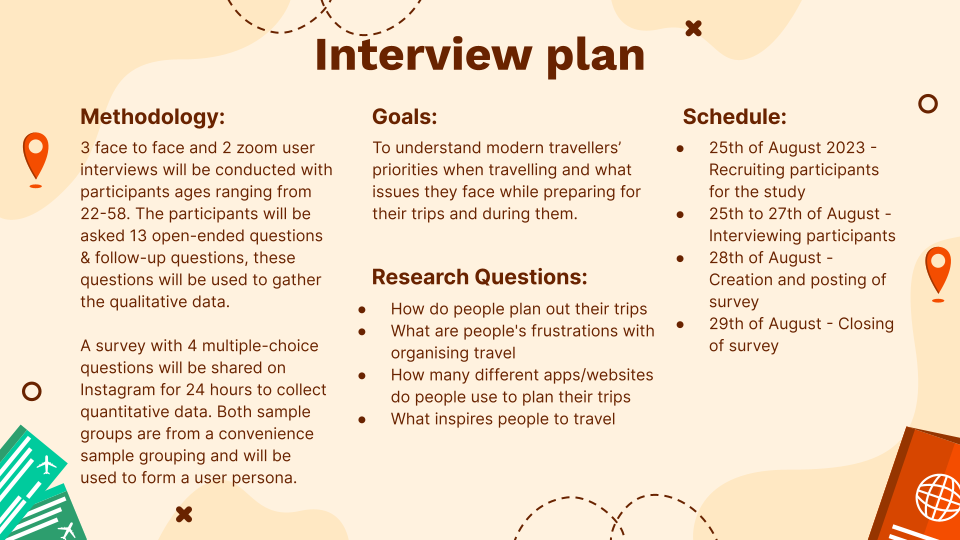
Above is the interview plan, this was a crucial initial step, enabling the identification of user challenges. The insights gathered paved the way for a comprehensive exploration into potential solutions and a thorough analysis of competitor apps, unveiling their strategies in addressing similar issues.
I believe that creating an app dedicated to travellers sharing practical information about their recent trips will help others struggling to find information online to find reliable information about these locations to plan their future travels. Tripify is a travel app to help travellers solve the issue of trying to find reliable and up-to-date information on travel locations by connecting users with other travellers and providing a platform for them to share their experiences.
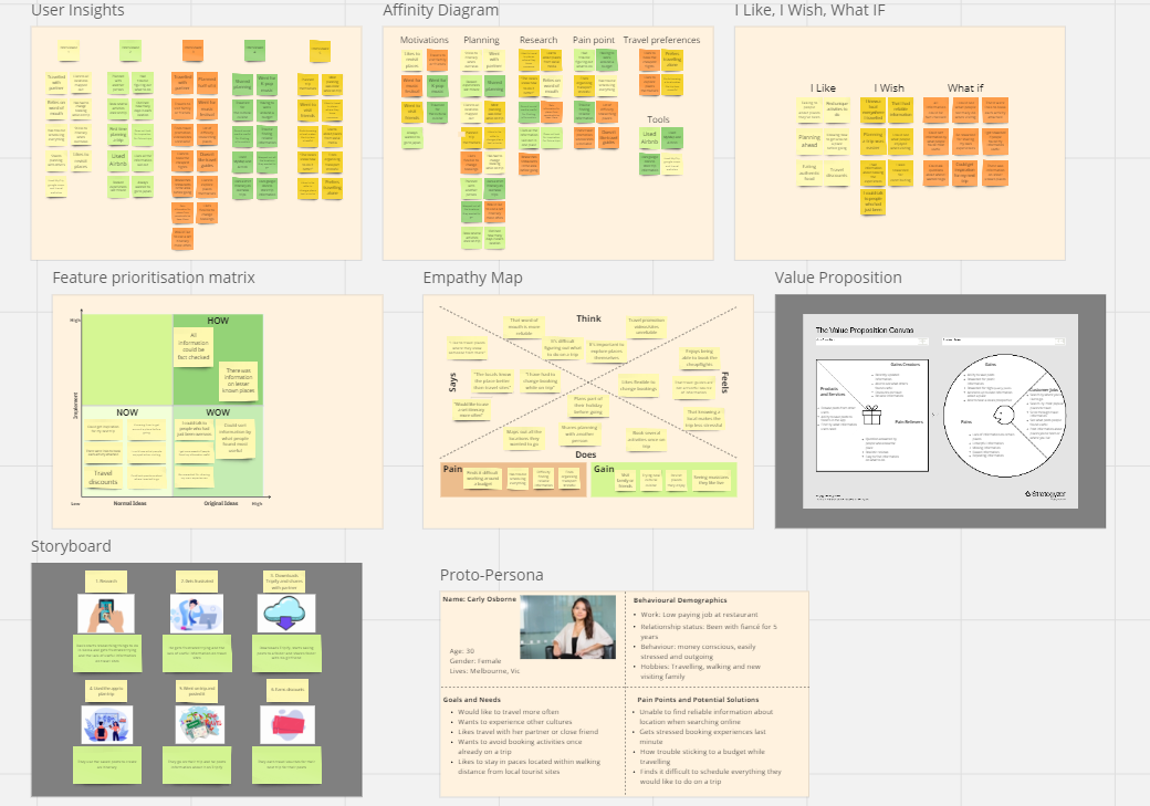
In the ideation stage I gathered the insights from the interviews and used them to create an affinity diagram, feature prioritization matrix and empathy map. After that I stated to brainstorm solutions and made an I like, I wish, What if diagram, storyboard, value proposition and proto person
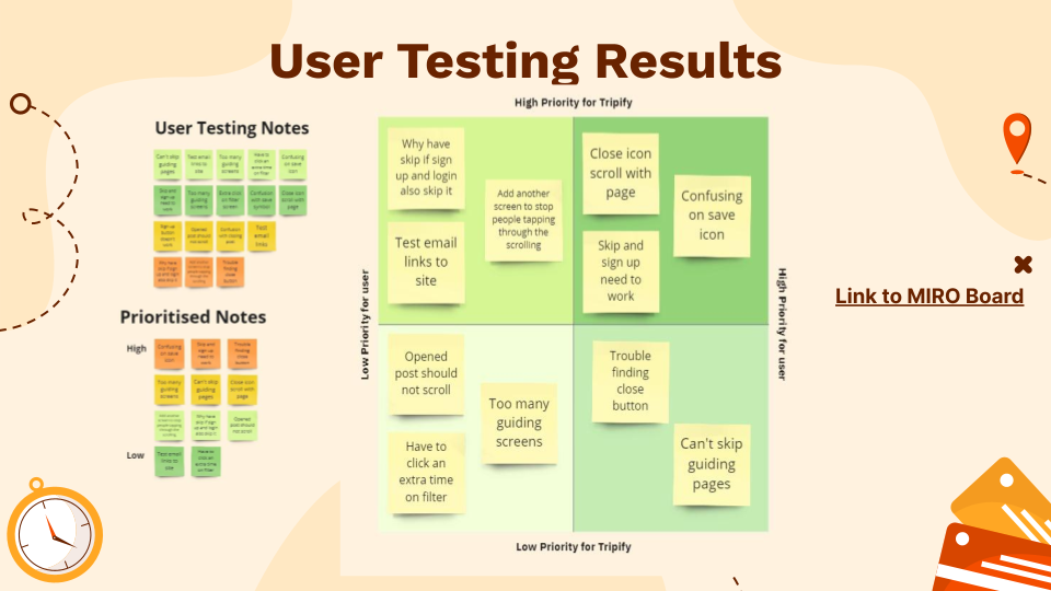
Once a low fidelity prototype was built, guerrilla user tests were conducted. I took the insights from these tests listed them out and prioritised them, then I further sorted them by their priority to users and their priority for company. This process gave me the main issues that needed improving for the next iteration.
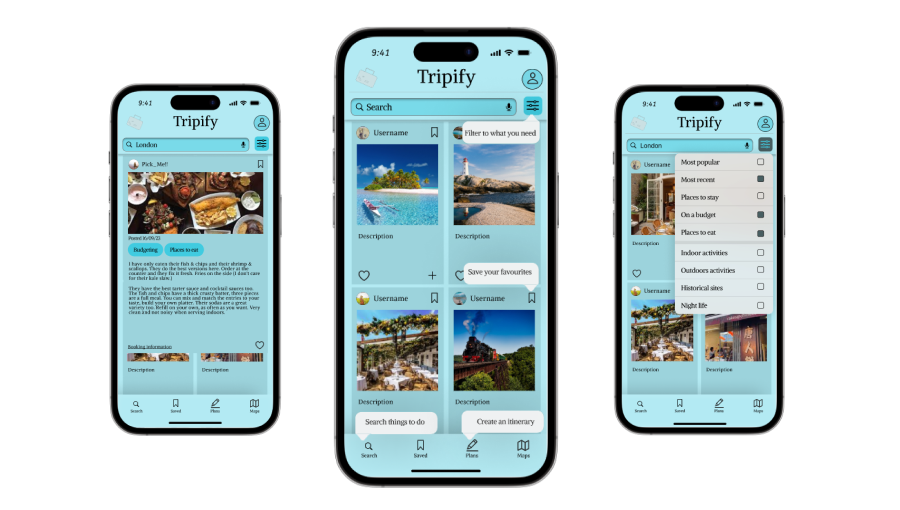
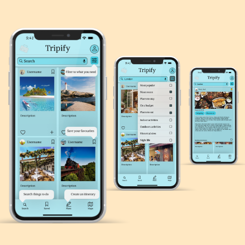
During testing, several key issues were identified, including confusing iconography where non-standard icons were used for their respective functions. Additionally, users expressed frustration with the excessive number of guiding screens, which impeded their experience, these issues were all rectified by the final prototype. Above are the three main pages of the low fidelity prototype and the final product of the case study. These pages include, in order from left to right, the home page, search function and a post details page
I wrote a case study about this project to show the design process and share more about some of the challenges we overcame.
See the Case Study